Wild Beyond
Wild Beyond is a mobile strategy game set in a fantastical galaxy with real-time battles, distinctive characters, and social multiplayer gameplay..
Skills: Wireframes, Visual Design, Prototype, Implementation
Role: UI/UX Designer
Introduction
I joined the Wild Beyond team to help improve the player experience on existing features and contributed to new milestones.
Business Goal
With a focus on attracting a new audience, Strange Sevens is a development studio created at Pocketgems with the intent to pull in talented individuals with experience in AAA titles.
Target Audience
Traditionally known for creating games in the casual space, Wild Beyond was an attempt to bring real-time competitive strategy typically found on pc and console to the mobile device.
Design Process
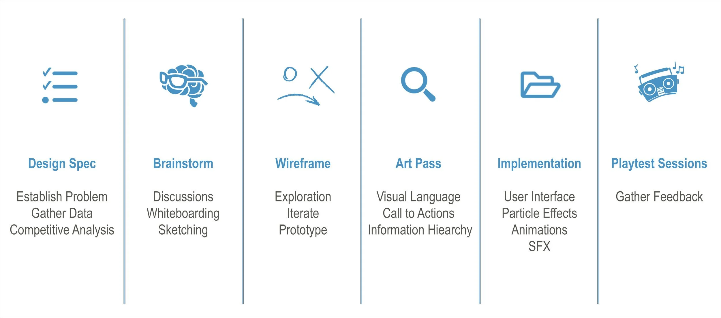
While there isn’t a standard development process, and each member’s needs vary from person to person, this was the process we adopted that worked well for our team.
Brainstorming
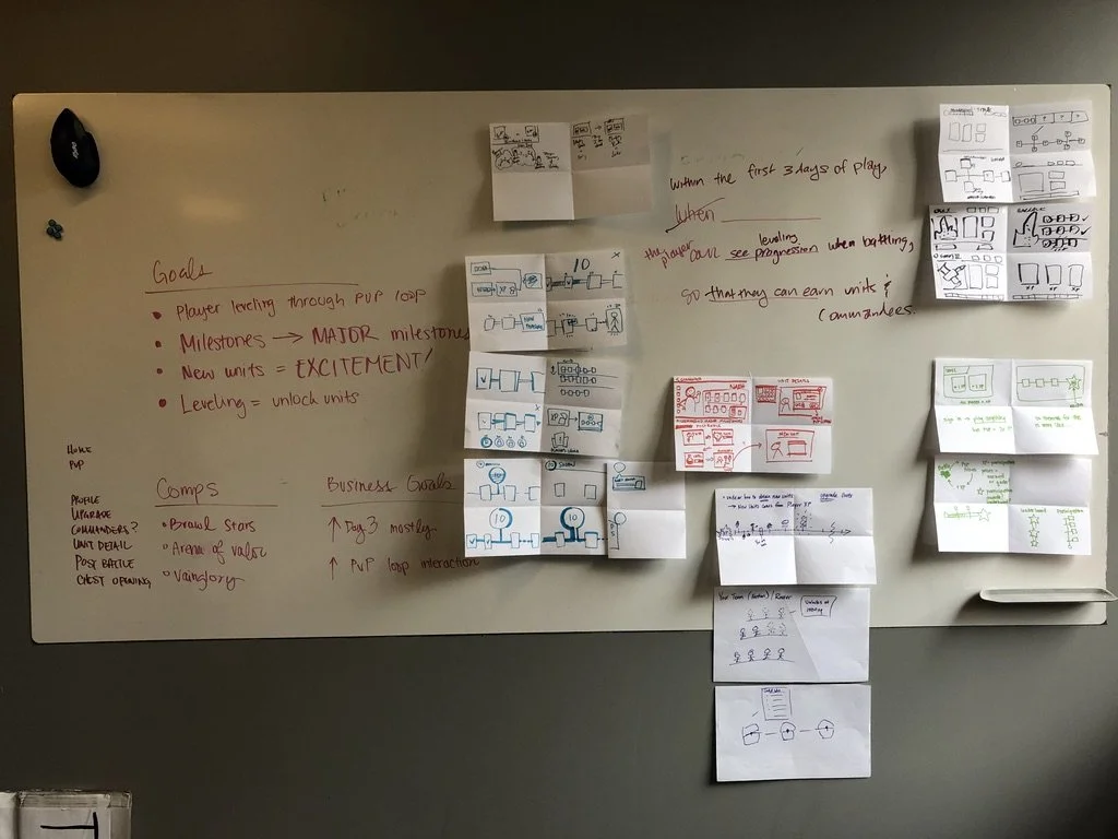
As a design team, we went through a few exercises to better understand player motivation and the goals they are looking to achieve while playing Wild Beyond. Is it to acquire new units? Unlock your favorite commander? Be undefeated in battle? Potentially, all the above?
Design exercise to understand player goals.
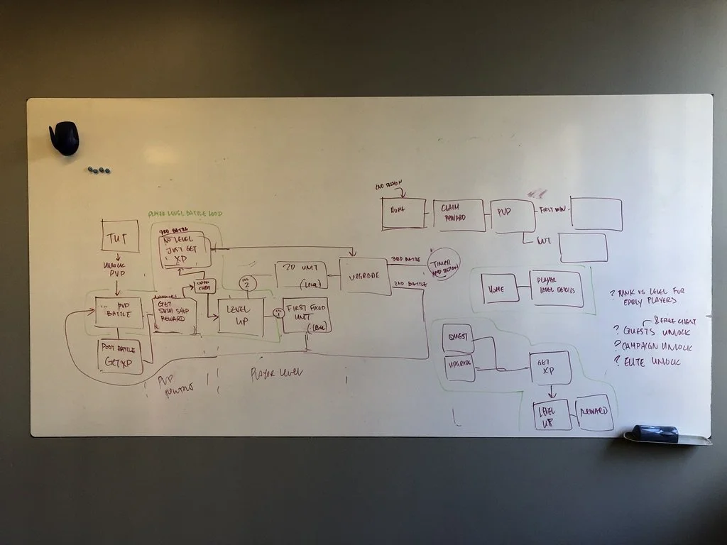
Exploration of the user journey and game flow.
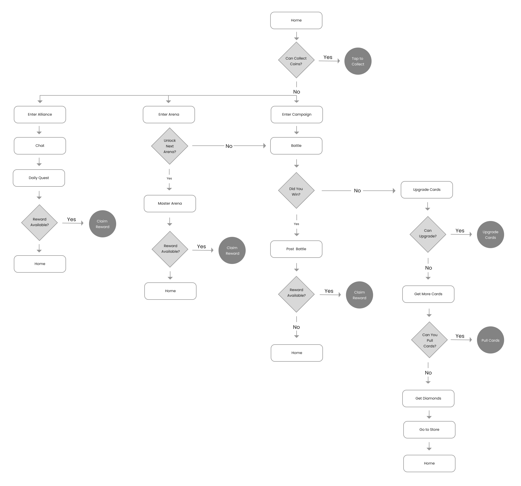
Gameplay Flow
A visual representation of the main journey we want our users to experience. Players should collect units, upgrade their decks, and master strategic moves against other players.
Early Metrics
Testing revealed the retention and conversion metrics were slightly below the requirements for a viable global launch. These metrics were pulled from previous company launches that resulted in a successful product.
In-game interface where players control units on a battlefield.
Battle Concerns
Retention metrics were lower than expected. Players were not returning as intended. After analyzing the testing data and surveys, we concluded that players were not fully grasping game mechanics that would otherwise provide a battle advantage. They are losing at an unfavorable rate. We attributed these to the following realization:
Players are not understanding the benefits of taking control of map resources.
Confusion on how the miners affect the income and how it’s related to the resource bar.
Players do not understand why certain cards are disabled and nested.
The hardest concept to understand is the relation between the use of technology to unlock higher tiered units.
Battle Updates
The goal of the changes were to increase player understanding of the complex battle mechanics. The following was implemented:
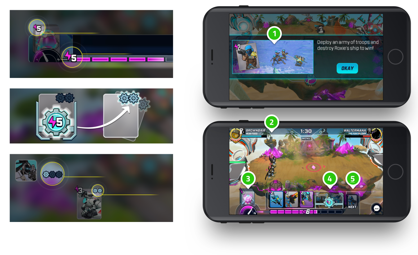
Added a step-by-step introduction and tutorial of game mechanics.
Divided the player and enemy zones by color to reinforce the concept of map resources. Players now have a visual distinction when the middle rally point is claimed.
Changed the imagery and added a set limit of resource cards. We also connected a resource gauge to the energy bar.
Higher tiered cards are locked behind a gate with an unlock button with energy requirements.
Players can view the next card in play to better plan their strategy.
Conversion Changes
To improve conversion, we built several monetization channels supported by instant boosts and subscription models. The intention is to have players log in more frequently with these daily benefits.
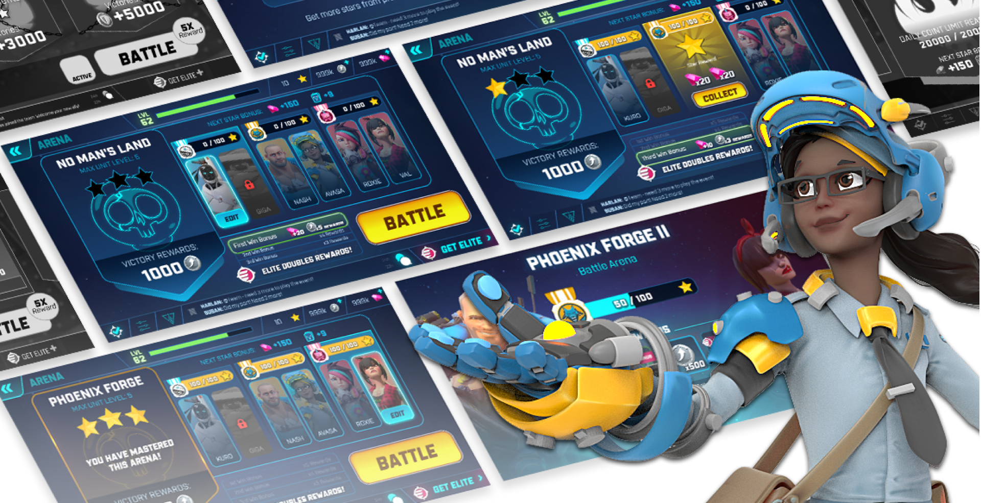
To further improve conversion, we opted to create an elite membership feature that promotes in-game values. This is the fast track for players to level up and gain battle advantages.
We advertised the membership benefits in areas where players would interact with regularly.
Final Designs
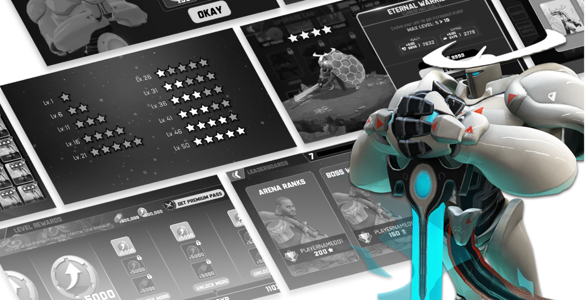
Wireframes: I created higher fidelity wireframes and documents to share with the Visual Designer, Allison, to take a color and style pass.
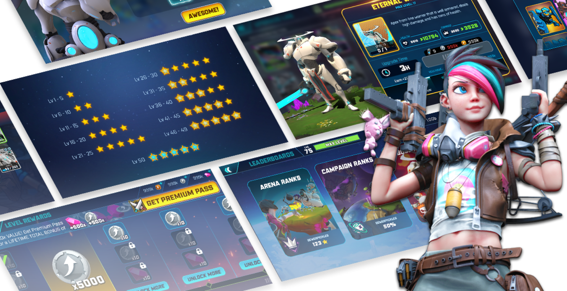
Visual Design: We worked together and I provided her with any needed feedback. Here are the results of her style pass.
Implementation: Once the designs are approved by the Art Director and Product Owners, I worked with the Engineering team to implement in the custom Mantis engine.
Home Screen Exploration
With each release and addition of features, it became increasingly unclear what the main focus was. Everything had a loud bright yellow call to action; however, it soon became apparent that the call out was losing its affect.
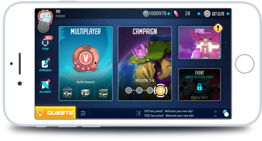
Home Screen (Version 1)
This is the original Home Screen. A few benefits to this layout is that information is relatively easy to read and tap.
Home Screen (Version 2)
As we built additional features, we began to realize that it became more difficult to highlight wants important. When all the features are unlocked and active, it becomes too visually loud and noisy. Also, certain features have further nested screens.
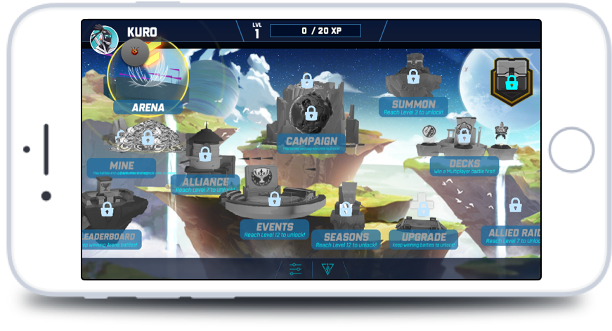
Home Screen (Final Prototype)
It became increasingly clear that we need a more accessible home screen. After much brainstorming and exploration, we decided on a horizontal scrolling page that allows easy access to all important features. Players can quickly and easily access any updated features.
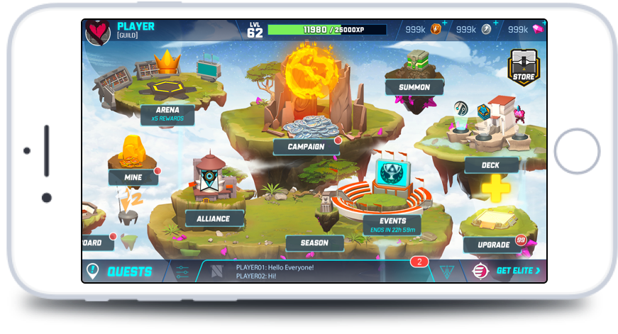
Home Screen (Final Version)
This is the finalized version of the updated home base. Players can easily view any updates with the red notifications. Furthermore, we can draw attention to certain buildings through the use of VFX.
Player Reactions
Feedback from the Wild Beyond Forums have been relatively positive. Players seem very excited with the announcement of the upcoming updates.


